

Digital Ecosystem: Politécnico GC
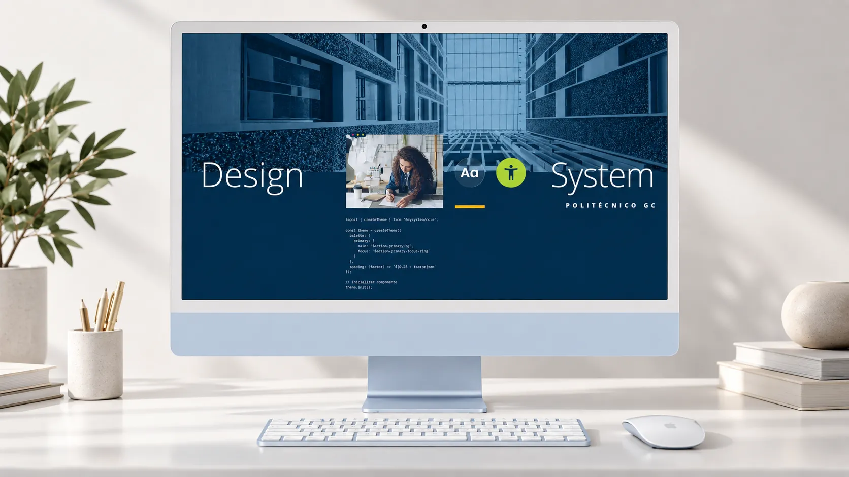
Creation of an accessible design system for an institution with more than 50,000 users, integrated with the development stack
Role
UX Lead & Design System Architect
Client
Politécnico Grancolombiano
Period
2025 - 2026
Company
Appicua
Stack
An institution with 50,000 users and accumulated technical debt
Politécnico Grancolombiano is one of Colombia's largest higher education institutions, with over 50,000 students, faculty, and staff who rely daily on its digital ecosystem to manage everything from enrollment and grades to internal communications and technical support.
The digital ecosystem comprises over 500 applications built over several years by different teams at different times, without a shared design guide. As a result, it accumulated visual inconsistency, fragmented experiences, and technical debt that hindered any incremental improvement.
+50,000
Users
+500
Apps
- Not accessible
- Inconsistent experience
- Technical debt
UX Lead and Design System Architect
As UX Lead, I took on both the strategic dimension and technical implementation leadership. My role ensured the project didn't stop at design guidelines and documentation, but produced concrete deliverables directly applicable by the institution's development teams.
- Initial audit of the digital ecosystem and design debt diagnosis
- User research: group interviews by segment (students, faculty, administrative staff)
- Design system architecture: tokens, components, documentation, and accessibility guidelines
- Leadership of the design and development team during implementation
- WCAG 2.2 AA compliance verification with an external auditor
- Knowledge transfer to Politécnico's internal teams
From diagnosis to continuous improvement
When we began the diagnosis, Politécnico had a Figma file with some usage guidelines and a corporate color palette. Each development team made their own decisions about components, typography, spacing, and interface behavior. The result was predictable: visual inconsistency, fragmented experiences, and technical debt accumulated over years that hindered any incremental improvement.
My approach proposed five interdependent stages — from user understanding to technical implementation and continuous evolution:
- Understand
Interviews with users and behavior analysis to identify real friction points.
- Design
Accessible components based on real user needs.
- Implement
Design Tokens, Angular component library, Docusaurus portal, and Storybook as a bridge between design and code.
- Document and scale
Governance that allows teams to adopt the system autonomously.
- Evolve
UX metrics structure and continuous feedback process—the system improves with use.
Solution Summary

Figma Design System
Tokens, components, and patterns for design teams.
- Primitive and semantic tokens
- 40+ components with documented variants
- WCAG 2.2 contrast matrices

Component Library
From Figma to code: synchronized and documented Angular components.
- Tokens synchronized with Style Dictionary
- Interactive documentation in Storybook
- Seed repository and accessibility linters
- Distribution via Azure Artifacts

Documentation Portal
The gateway to the design system for the entire institution.
- Usage, installation, and migration guides
- Direct links to Figma and Storybook
- Accessible for design, development, QA, and leadership

Accessibility Protocol
WCAG 2.2 AA guides and checklists adapted to each role.
- Validated with an external auditor
- Checklists for executives, designers, developers, and QA
- Linters integrated into the development workflow

Measurement Strategy
A KPI system to evolve the ecosystem with real data.
- GA4, Clarity, NPS/CSAT, Core Web Vitals
- 7 key indicators: efficiency, friction, satisfaction, conversion, accessibility, retention, engagement
- Continuous improvement cycle: measure, analyze, prioritize, act
The educational community
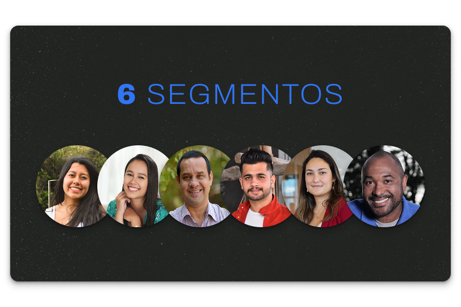
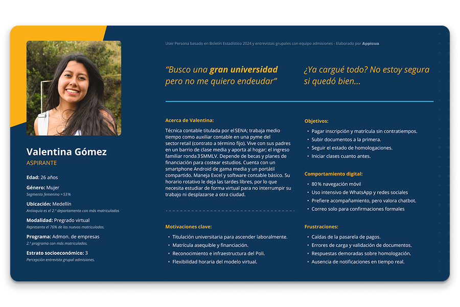
Segmented group interviews were conducted by profile — on-campus and online students, faculty, and administrative staff — to identify where the digital ecosystem created friction, cognitive load, and abandonment. The exercise was complemented with community characterization data: predominant devices, connectivity levels, and access contexts. The findings were synthesized into research deliverables: user personas by segment and empathy maps that allowed the team to align design criteria with real needs and make evidence-based decisions.
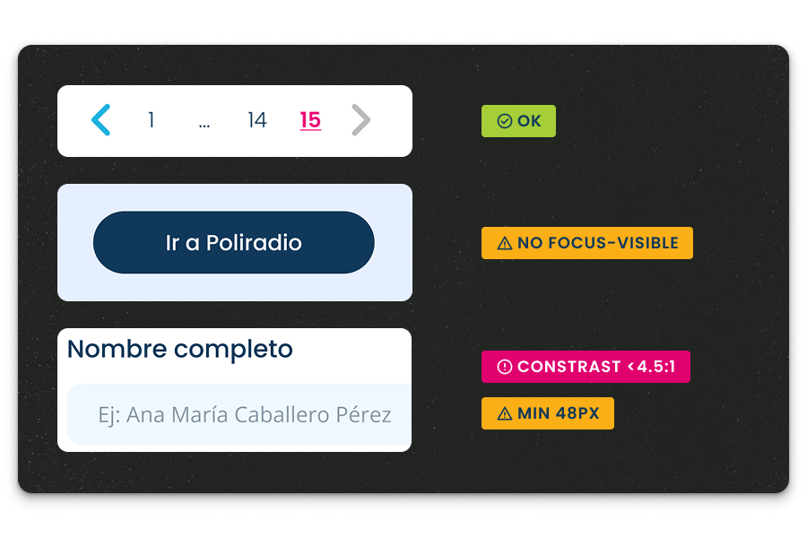
In parallel, I conducted an audit of the existing system to understand the technical starting point: what components existed? How many were consistent with each other? What patterns repeated? Where did color contrast fail? What flows lacked error or loading states? This diagnosis was critical to prioritizing what to build first and what level of refactoring each part of the system required.
A comprehensive, scalable, and adoptable system
With research findings as the foundation, I transformed the Figma file with basic guides into a comprehensive, scalable, and adoptable system. The work was organized into three layers:
- Token layer. I defined a design token system based on primitive and semantic variables that centralizes all style decisions — colors, typography, spacing, radii, elevations — and exports directly to the Angular seed project. Any change to the design system automatically propagates to code, eliminating the disconnect between Figma and production.
- Accessibility layer. I built contrast matrices to validate WCAG 2.2 AA compliance across the entire palette in light mode and frequently used combinations. Based on recommendations from an external auditor, I led the redesign of critical components — forms, tables, modals, status messages — documenting accessible states and decisions in each case.
- Figma component layer. The library evolved with consistent naming, properly structured variants, and token-linked properties, also detailing usage and editing flows.
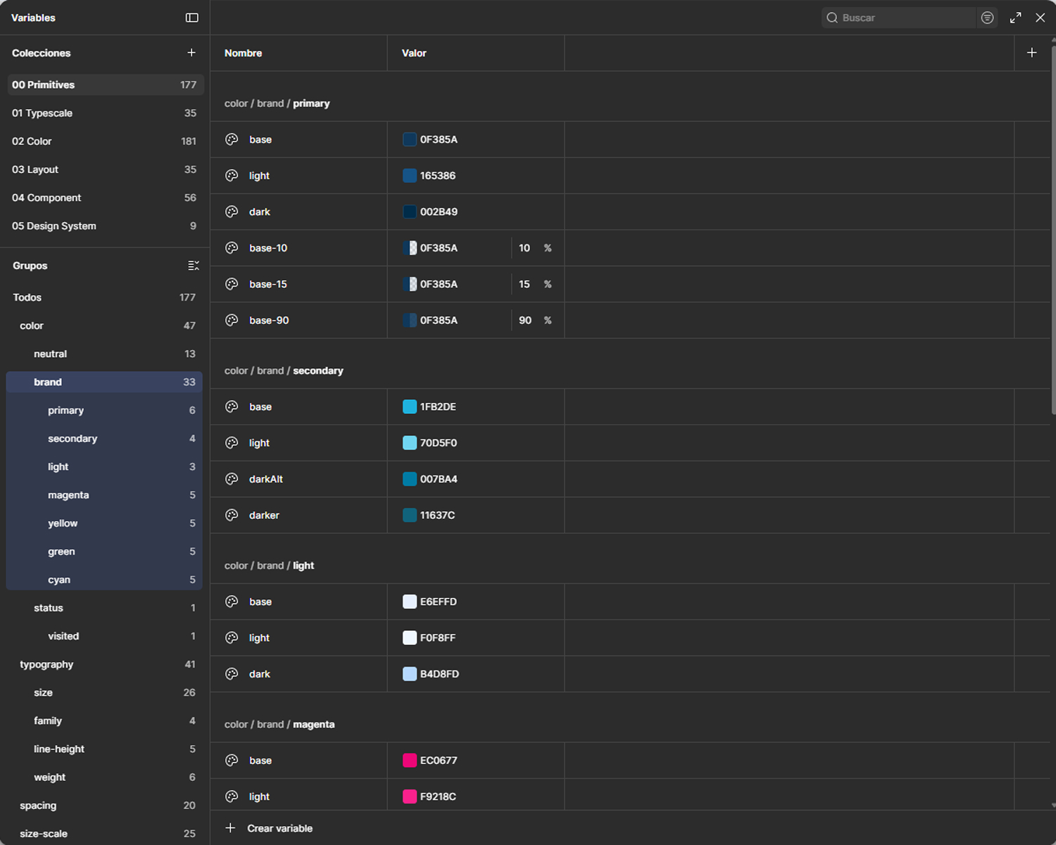
Variables panel
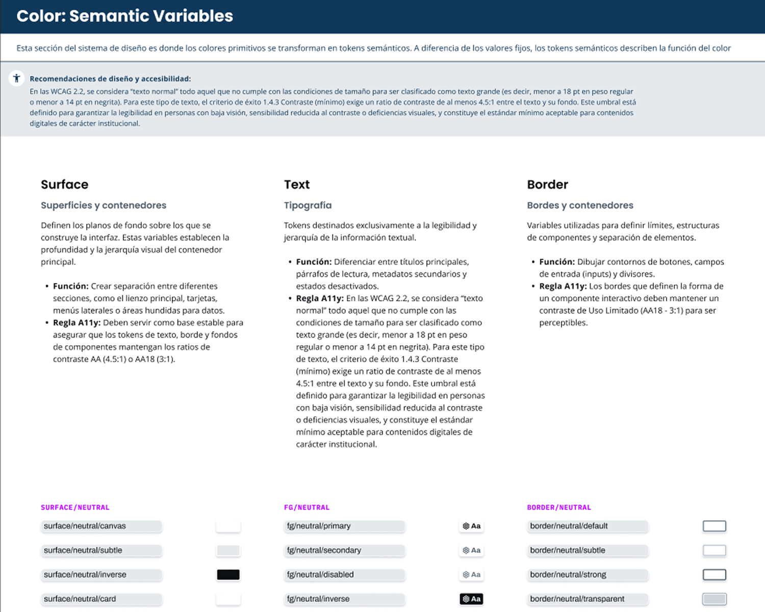
Semantic variables documentation
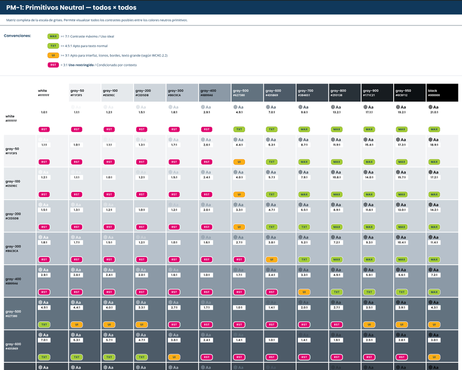
Contrast matrices to verify WCAG 2.2 AA compliance
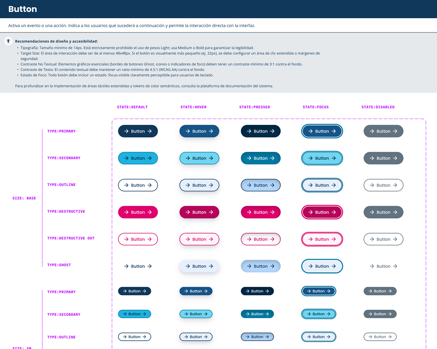
Button component variants and states
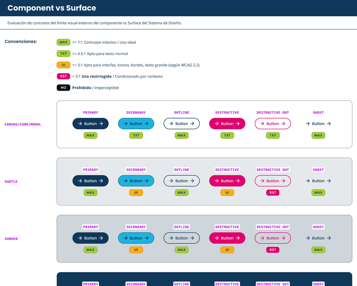
Button component contrast tests on different surfaces
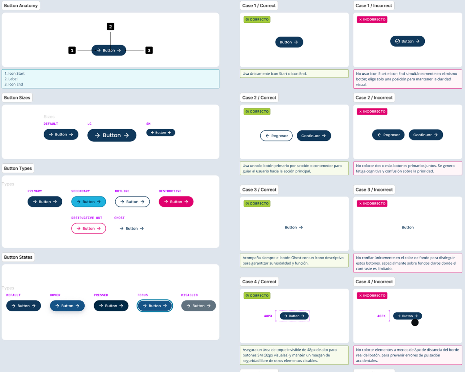
Button component anatomy and use cases
From design to code with AI tools
With AI tools support, I developed the technical deliverables that convert the design system into something development teams can consume real and autonomously.
- Token architecture with Style Dictionary. Tokens defined in Figma are exported and transformed via Style Dictionary into three levels: primitive variables store pure values as they exist in Figma; semantic variables express usage — with name and description — so a developer understands purpose without consulting the designer; components consume only semantic variables, ensuring consistency and ease of maintenance. This pipeline ensures any Figma change propagates in a controlled manner to code.
- Angular component library. Each component reflects exactly the properties and variants defined in Figma, maintaining the correspondence between design and implementation. The library is distributed through Azure Artifacts, enabling versioned management and orderly adoption by the institution's different development teams.
- Accessibility linters. Specific linters were integrated to validate WCAG 2.2 AA compliance during development, reducing dependency on manual reviews and catching accessibility issues before they reach production.
- Seed repository. Base front-end project with examples of the most common patterns and screens, so teams can start new projects with the correct architecture from the start.
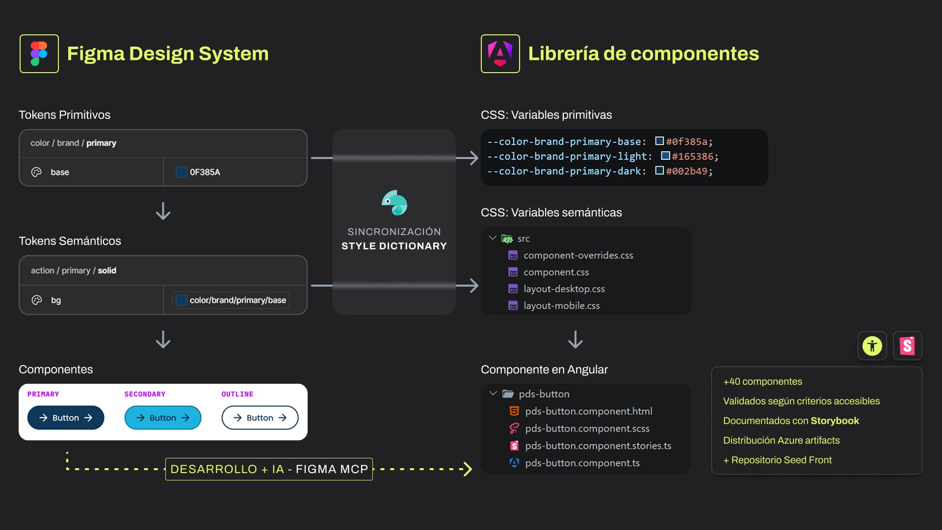
Diagram Description
The diagram shows the flow from Figma to code in two columns. In Figma, primitive tokens (for example, color/brand/primary/base with value 0F385A) transform into semantic tokens (action/primary/solid), which are applied to components—illustrated by the Primary, Secondary, and Outline button variants. Both token layers go through a synchronization process with Style Dictionary, converting them into primitive and semantic CSS variables in code. These variables feed into Angular components, represented by the pds-button folder with its HTML, SCSS, Storybook stories, and TypeScript files. The result: over 40 components, validated with accessibility criteria, documented in Storybook, and distributed via Azure Artifacts, plus an additional seed repository. The entire flow also feeds context to AI agents through Figma MCP.
Without documentation, there is no adoption
A design system without accessible documentation is ignored. The goal of this stage was to convert all technical deliverables into a shared source of truth for designers, developers, QA teams, and leadership, and lay the groundwork for the system to expand beyond current applications.
- Documentation portal (Docusaurus). The gateway to the design system for the entire institution. The portal organizes general principles, visual and technical foundations, installation, usage and migration guides from the previous version, detailed description of each component with its properties, and direct links to components in Figma and their Storybook stories. It's designed to grow: the goal is to eventually cover other institution products and channels — communications pieces, virtual learning objects, simulators, and social media — under the same consistency and accessibility principles.
- Component documentation in Figma. Each component is organized for design teams with complete variants, contrast tests against system surfaces, component anatomy, and use cases with examples of what to do and what to avoid. The goal is for a designer to make correct decisions autonomously.
- Technical documentation in Storybook. Each Angular component is linked to its Storybook entry, where development teams find specific documentation, applicable accessibility principles, interactive stories, and code examples.
- Accessibility documentation for the entire organization. An introduction to digital accessibility prepared by the external expert was incorporated into the portal, along with protocols, guides, and checklists adapted to four different profiles: executive teams, design, development, and QA.
- Knowledge transfer. To ensure the system didn't remain in documentation but in real practice, knowledge transfer sessions were held with Politécnico's internal teams, with emphasis on digital accessibility. Project closure ensured teams could work autonomously.
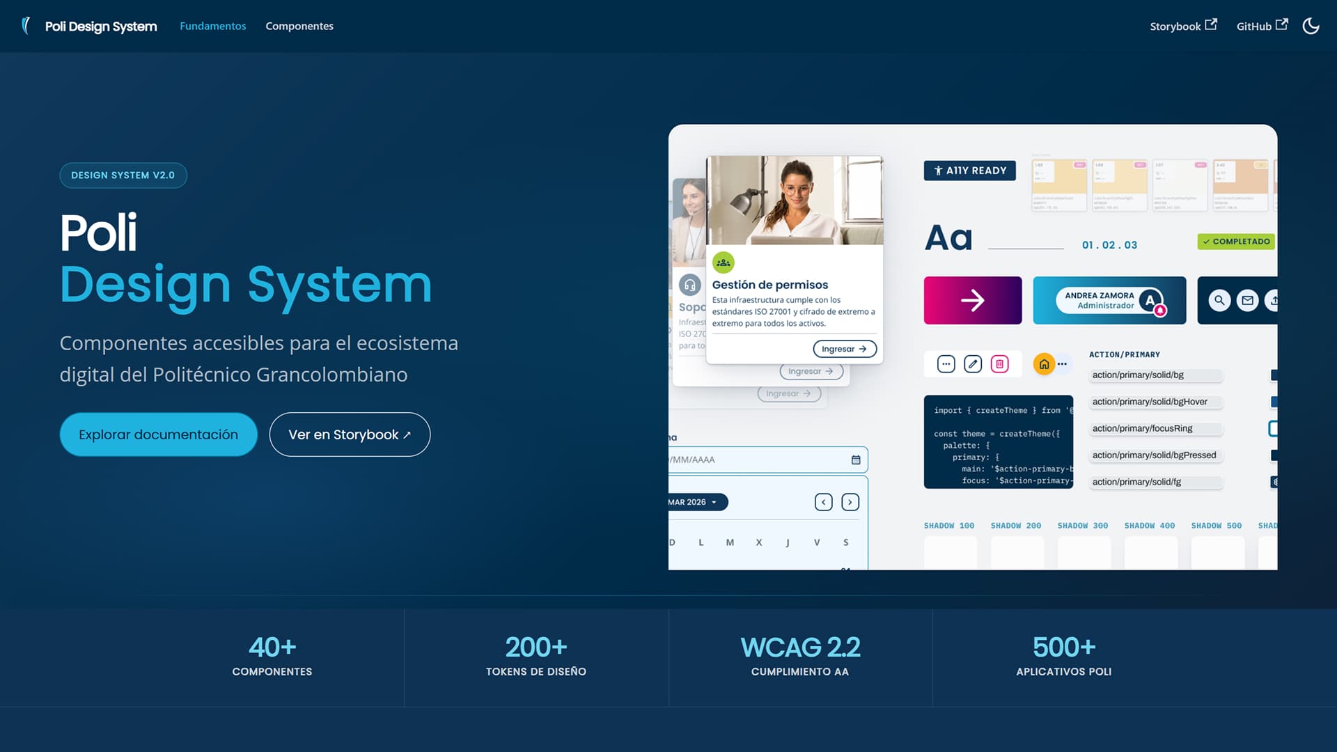
Documentation portal developed in Next.js and Docusaurus
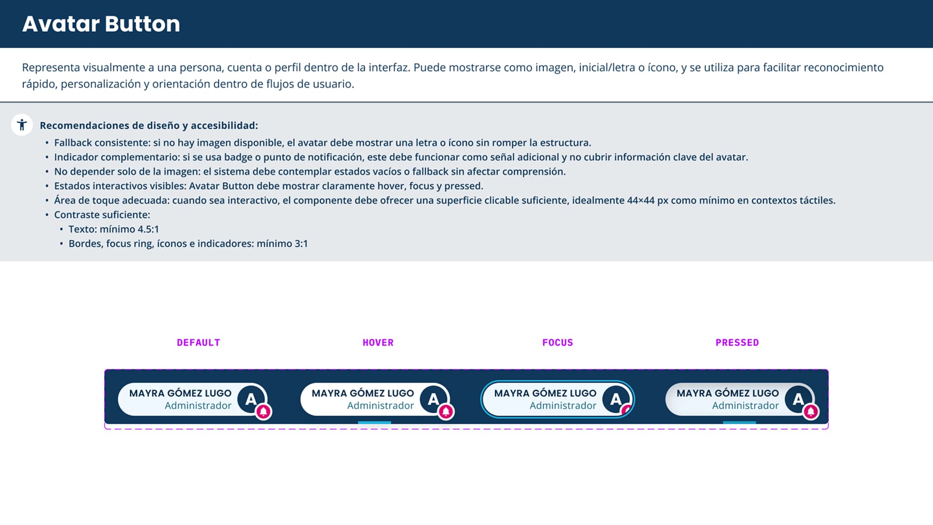
Component documentation in Figma Design System
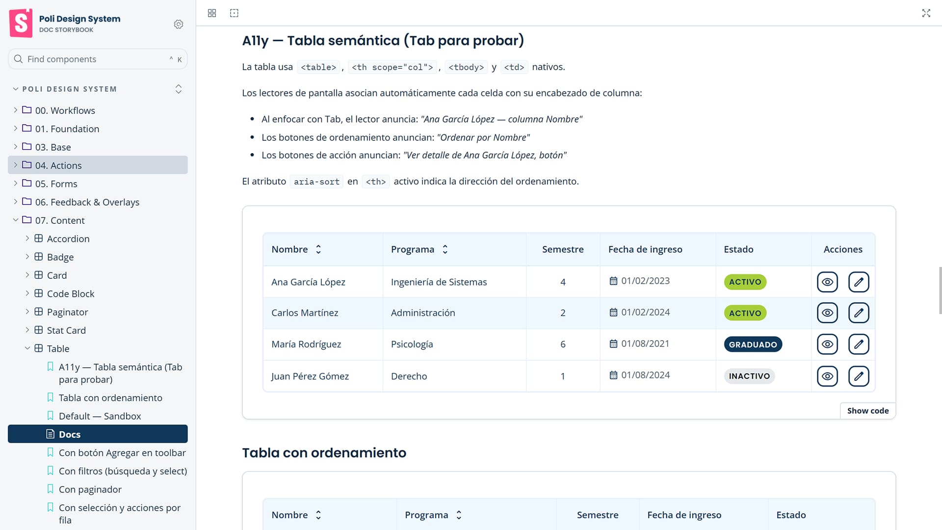
Technical and accessibility documentation in Storybook
Comprehensive measurement strategy
The measurement strategy closes the project loop: it allows the design system to evolve with real evidence rather than assumptions. I developed a comprehensive UX/UI measurement strategy for Politécnico to continuously evaluate application quality and make data-driven decisions.
- Measurement stack. The strategy combines four complementary tools:
- Google Analytics 4 with Google Tag Manager for behavior data and conversions at scale
- Microsoft Clarity for heatmaps and session recordings that reveal real interface friction
- NPS and CSAT surveys integrated into key flows to capture satisfaction at the right moment
- Core Web Vitals monitoring (LCP, INP, CLS) integrated into the CI/CD pipeline to ensure technical performance doesn't hinder experience
- Seven key indicators. The strategy defines KPIs organized into seven categories:
- Efficiency (success rate and time per task)
- Friction (errors, rage clicks, abandonment)
- Satisfaction (NPS, CSAT, SUS)
- Conversion (key flows like enrollments and applications)
- Accessibility (WCAG 2.2 AA compliance)
- Retention (users who return)
- Engagement (frequency and depth of use)
- Continuous improvement cycle. Data feeds a systematic four-phase cycle: measure, analyze, prioritize, and act. Prioritization is supported by an impact-effort matrix to focus resources on what affects the most users. Each implemented change is documented with its improvement hypothesis so the next cycle can evaluate its effect.
- Governance and privacy. The strategy includes clear roles and responsibilities for Politécnico's multidisciplinary team, a quarterly reporting cadence to leadership, and privacy guidelines aligned with Law 1581 of 2012 — data anonymization, informed consent, and exclusion of sensitive personal information from all measurement tools.
The result is a design system conceived as the foundation of a continuous improvement process: each iteration of Politécnico's digital ecosystem can rely on real data from its 50,000 users to make more precise and justified design decisions.
Impact
The project is in progressive implementation phase. Adoption metrics and business results will be available in the second half of 2026. What is verifiable right now is the scope of the problem solved and the depth of deliverables produced.
| Dimensión | Cifra | Contexto |
|---|---|---|
| Ecosystem users | 50,000+ | Students, faculty, and administrative staff |
| Applications covered | 500+ | Backoffice and end-user interfaces of the institution |
| Technical debt addressed | ~20 years | Without unified design system until this project |
| Segments researched | 6 | On-campus students, online students, faculty, administrative staff, prospective students, alumni |
| Token levels | 3 | Primitive → semantic → components |
| Profiles trained in accessibility | 4 | Executive, design, development, and QA teams |
| Accessibility standard | WCAG 2.2 AA | Validated with external auditor |
| Measurement KPIs defined | 7 categories | Efficiency, friction, satisfaction, conversion, accessibility, retention, engagement |
| Measurement tools | 4 | GA4, Microsoft Clarity, NPS/CSAT, Core Web Vitals |
| System technical stack | 6 tools | Figma, Style Dictionary, Angular, Storybook, Docusaurus, Azure Artifacts |
| Design system stages | 4 layers | Tokens, accessibility, Figma components, Angular implementation |
| Distribution channel | Azure Artifacts | Centralized versioning and updates for all teams |
| Reduction in prototyping time | 35% | Measured in first applications developed under the new design system |
| Reduction in front-end development time | 40% | Measured in first applications developed under the new design system |
Thisprojectsynthesizeswhatitmeanstoworkwithend-to-endperspective:understandtheuser,designwithcriterion.implementwithtechnicalrigorandleavetheteamwiththeabilitytocontinuetheworkautonomously.